Train
Invest
Manifest
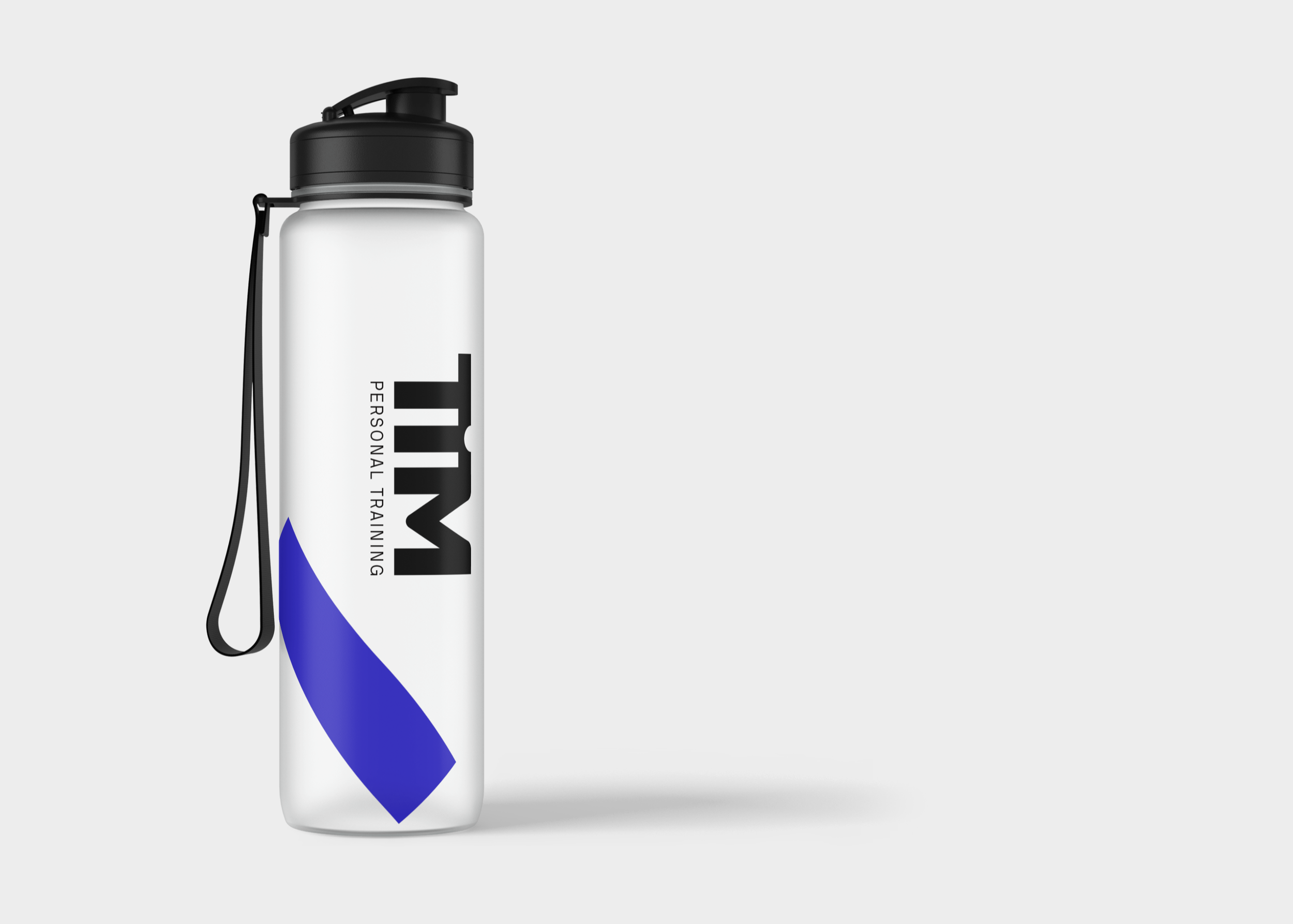
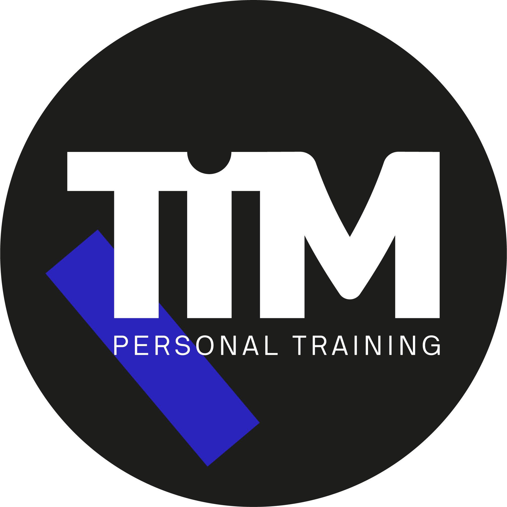
A logo and identity design for TIM, a brand new personal training studio in Amsterdam run by Tim van den Berg. With the ambition to improve people's health long-term, TIM stands for Train, Invest & Manifest.
Services
Consultancy
Identity design

Train with TIM
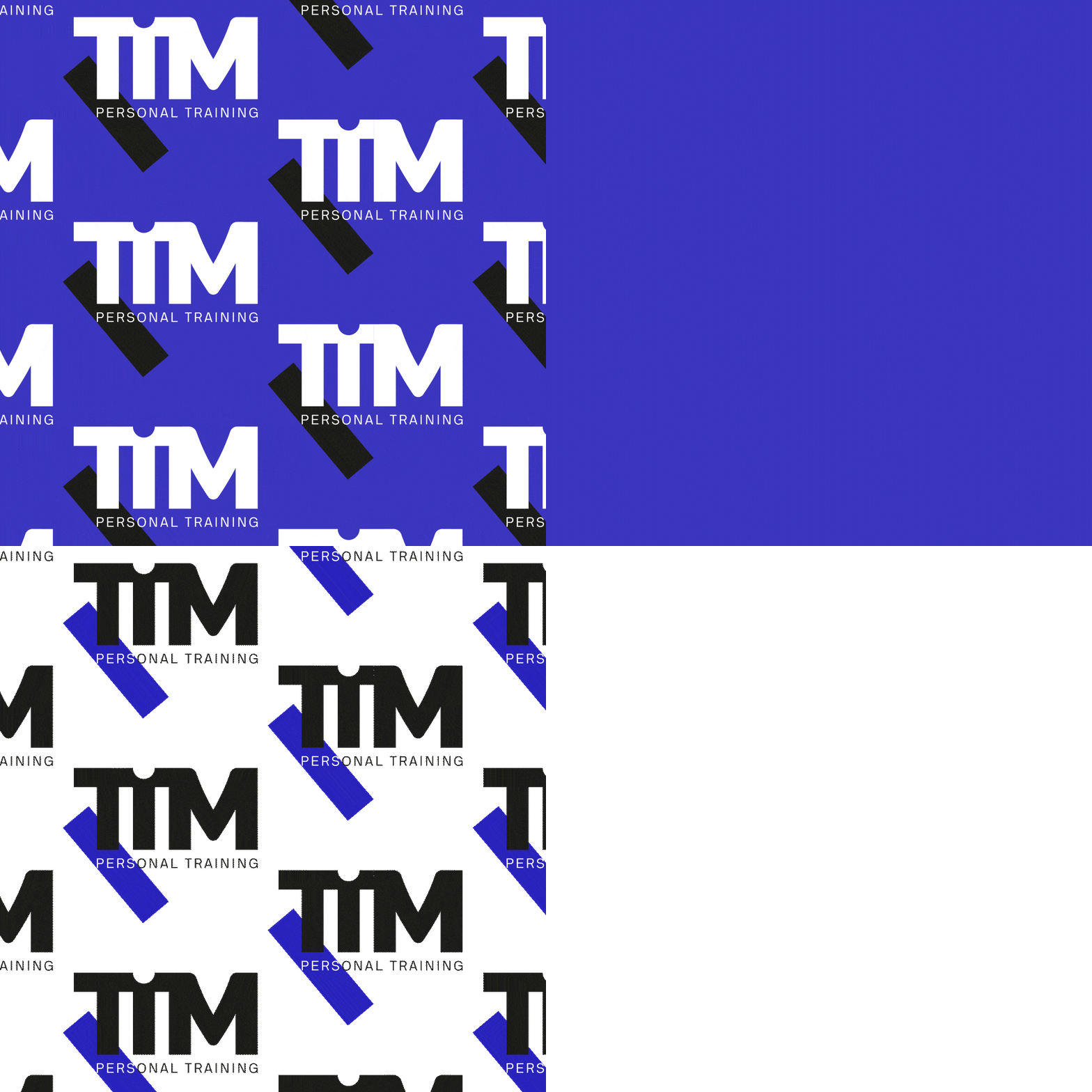
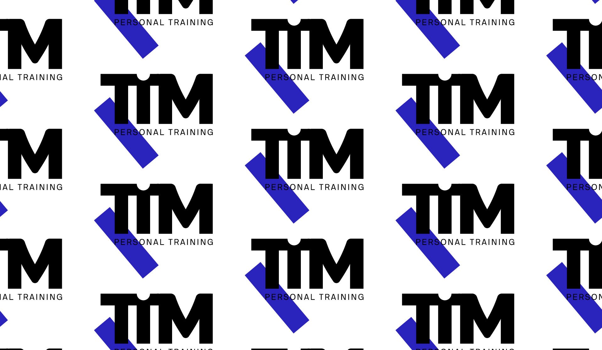
With the initial name, TIMPT changed to TIM, it all makes more sense. The logo's base shape is a fluid design of the three letters with an added negative space on the letter ‘I’. The rotated rectangle symbolizes the beginning of change, movement, and balance. The shape also provides color and is used for patterns and additional visual elements throughout the identity.


